This interview was given through video conferencing. This type of interview can be challenging because you have to make sure that the program you are using is working correctly. Programs like Skype, or AIM video can freeze or cut out sound which makes it difficult to hold a conversation and maintain a calm demeanor. I found that it is also challenging to find proper lighting and camera angel so that you can be seen well and still look good. I did like that in a video conference you can keep notes with you as a reference if you get flustered. I thought that it was a little less intimidating being in a separate place than your interviewer. Overall I still prefer a face to face interview because it is always good to connect with someone personally and avoid any miscommunications because of difficulty with the program us
Thursday, April 28, 2011
PSA
 |
| Add caption |
This Public Service Announcement was intended to encourage Georgia Tech professors not to give tests or quizzes during dead week. To accomplish this we knew it had to grab their attention, so we choose to use a zombie theme which is pretty popular at Tech. We wanted to emphasize that kids are exhausted during dead week and that professors would regret burdening us any further. We also wanted it to be quick and to the point because we know people have short attention spans. We achieved these goals by creating animations in Illustrator and putting them into a power point format. This gives the illustrations the feel of a cartoon and telling a story. I think that this PSA was effective because it got your attention and quickly go the point across while still sending a string message.
Poster Presentation

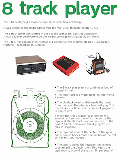
This poster was designed to explain how an 8 track player works. This was difficult because there are a lot of internal parts with technical names that would be confusing to someone who did not already know how an 8 track player works. To make this easier to understand I included an illustration of the inside of an 8 track player with all the parts labeled with their technical names. This way when you read the description next to the illustration you can refer to the picture to help understand the processes and parts. I also included some background information about the 8 track and a few pictures of the 8 track tape and player to give the technical description some context. I separated this from the rest of the text to keep the reader from getting confused by the 2 different types of information on the poster. I put the title large on the top of the page to balance the large picture at the bottom and so that it would be readable from far away.
Graphic Lies
Climbing the Grand Canyon |
I used Photoshop to overlay a picture of me climbing onto a picture of the grand canyon. I adjusted the sizes of each picture to make it look as if i was actually climbing the grand canyon. Photoshop can be used in advertisements to make something look different than it actually is. Although this happens more in magazines it can also be used by people selling stuff on Ebay to trick buyer into buying something that may not be as it appears in the ad online.
World's Largest Cupcake |
In this picture I made it seem that the Vesuvio Bakery had created the worlds largest cupcake.
This cupcake appears to be as large as the bakery is. However this is actually a regular sized cupcake that I photoshopped to look extra large. This is another example of how photoshop can be used to make objects seem more desirable than they really are. Objects can be made larger, smaller, different colors, or put in almost any location.
Resume
As a designer it is important that my resume reflect my design sense, so I used the document design principles to make my resume look polished and easy to read. I created a header for each section in order to break up the mass of text. This not only makes the document easier to read but it also provides and organizational structure for the entire document. I kept a fairly consistent template for each entry so one does not overpower the entire document. I also used indentations and kerning to make the document easier to navigate and read.
Subscribe to:
Comments (Atom)


